



10 UX Principles Every Successful Shopify Website Should Embrace
Your Shopify website is more than simply a storefront in the digital era; it's a doorway to a world of opportunities. But in order to attract and keep visitors, that gateway needs to provide a top-notch user experience (UX). Every connection with a potential consumer should be simple, clear, and memorable from the time they land on your website. In this article, we'll go in-depth on the ten fundamental UX concepts that may make any Shopify website into a lively, client-focused environment.
Imagine yourself browsing a wonderfully organized store where everything is easily accessible, the shelves are well-organized, and the decor suits your tastes. The online world requires the same level of consideration as the real world does. Responsive design, or creating a website that works on all devices, is the first step in capturing your audience. Your customer should have a consistent and enjoyable browsing experience whether they are using a laptop or a smartphone.
Principle #10:Responsive Design – Where Accessibility Meets Aesthetics
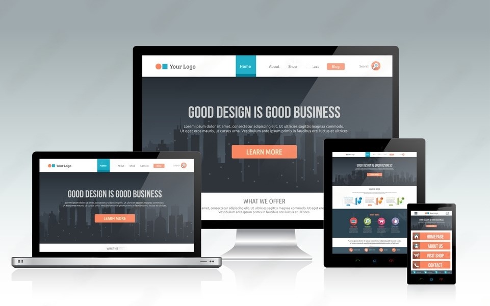
Your website's versatility is more important than ever in an age of varied gadgets. The secret to making sure that your Shopify store looks and performs beautifully on all screen sizes is responsive design. On a desktop computer, laptop, smartphone, tablet, or other device, a visitor should have the same aesthetic appeal and usability. By doing this, you not only build a consistent brand image, but you also keep potential clients from leaving your website after having a bad user experience.
The goal of responsive design is to optimize the entire user experience, not merely fit content onto different screens. Your website should have clear text and intuitively placed buttons on every device. The customer's journey should be smooth and interesting whether they are browsing products, reading reviews, or making a purchase. By embracing responsive design, you can ensure that every user can interact with your brand without difficulty or hindrance.
Principle #9: Intuitive Navigation – Guiding Users with Precision and Ease

Imagine entering a store and knowing exactly where to look for the things you want. The same idea applies to your online store: easy-to-use navigation should guide visitors to their desired location. The key to ensuring that visitors can browse your offerings without getting lost or overwhelmed is a clear and organized menu structure.
User engagement can be significantly impacted by carefully categorizing products and designing comprehensible menu labels. Frustration and abandonment might result from cluttered menus and unclear labelling. However, a well-designed navigation system increases customer confidence in your brand while also assisting users in finding what they're looking for. Join us as we explore the art of creating visually stunning product pages that increase conversions in the part that follows.
Principle #8: Compelling Product Pages – Turning Browsers into Buyers
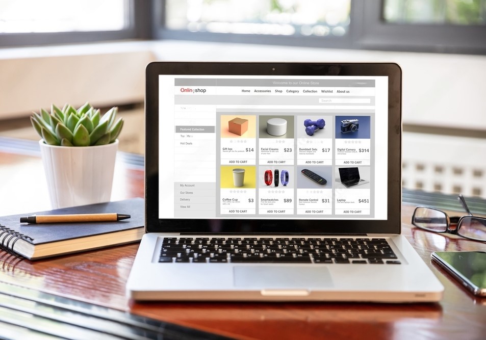
The center of your Shopify store is made up of your product pages. They are the places when shoppers finally decide whether to buy something or walk on. It takes an art form to create captivating product pages that intrigue, educate, and convert. An appealing product presentation is made possible by excellent photography, clear product descriptions, and compelling calls to action.
Visitors can instantly understand the value your products give thanks to a user-friendly layout and conveniently available product data. The user experience can be further improved by incorporating customer evaluations and ratings because they build trust and demonstrate social proof. Your product pages become a spark for converting interested shoppers into devoted customers with easy navigation and compelling information. Join us in the next section as we discuss how crucial it is to optimize checkout procedures for more seamless conversions.
Principle #7: Streamlined Checkout – Minimizing Friction for Seamless Transactions

A cart that is abandoned represents a chance lost. The checkout procedure is the last leg of the consumer journey, and any difficulty there can result in purchases being abandoned. Removing steps that are not essential, minimizing form fields, and offering clear details regarding shipping, taxes, and payment alternatives are all part of streamlining the checkout process.
Especially for repeat customers, offering guest checkout options and allowing users to save their payment information can greatly speed up the process. You may reduce obstacles to purchasing by designing a streamlined checkout process, which will eventually increase conversions and consumer happiness. Let's continue by discussing the importance of utilizing persuading graphics and compelling writing to improve user experience on your website.
Principle #6: Visual Appeal and Engaging Copy – Crafting a Captivating Narrative

The dynamic combo of images and language helps to tell the tale of your brand and products. While engaging writing educates, persuades, and leads visitors through your products, captivating photos, videos, and graphics capture their attention. Together, these components build an engaging user experience that connects with your audience.
Users can feel a connection through strong and relatable copywriting, which motivates them to act. It's important to emphasize benefits, solve client pain points, and directly address their objectives rather than simply listing features. Your website transforms into an interactive adventure that creates an impression when combined with great pictures that stir emotions. In the subsequent part, we'll examine how quickly loaded pages and fluid operation affect customer pleasure.
Principle #5: Speed and Performance – Keeping Users Engaged with Swift Interactions

In the quick-moving digital world, a slow website might ruin an otherwise good deal. Pages that load slowly can make users angry, raise bounce rates, and hurt your search engine rankings. In addition to being essential for user pleasure, speed and efficiency also help to keep visitors on the site and entice them to stay longer.
You can use a variety of techniques, such as image optimization, code minification, and the use of content delivery networks (CDNs), to speed up your Shopify website. A quick website improves user experience and demonstrates your commitment to making the customer experience as easy as possible. A website that loads quickly has a higher chance of retaining customers' attention, reducing bounce rates, and boosting conversions. In the part after this one, we'll discuss the importance of mobile responsiveness and its impact on user engagement.
Principle #4: Mobile Responsiveness – Capturing Audiences Across Devices

Our lives revolve on mobile devices, so it is essential that your Shopify website be mobile-responsive. Regardless of the device a user is using, a mobile-responsive website automatically adjusts to various screen sizes to give them the best possible experience.
A mobile-responsive design is essential for user engagement and conversions as more people browse and shop on their smartphones and tablets. It is an essential component of SEO because Google promotes mobile-friendly websites in its search results. Adopting mobile responsiveness increases user experience and broadens your audience and potential clientele. In the subsequent part, we'll discuss the significance of creating distinct calls to action (CTAs) for directing users toward desired tasks.
Principle #3: Calls to Action (CTAs) – Guiding Users Toward Conversions

CTAs serve as waypoints for users as they navigate your Shopify website. Strategically positioned and effectively designed CTAs are vital for encouraging user action, whether it is adding an item to the shopping cart, signing up for a newsletter, or making a purchase.
Action-oriented wording that expresses the advantage consumers will gain is key to creating powerful CTAs. CTAs' effectiveness also depends on where they are placed and how they are colored and designed. Your website's CTAs should be strategically placed across it to direct users toward desired actions and streamline their decision-making. Effective CTAs provide visitors a feeling of direction, turning them from passive viewers into active characters in your website's narrative. We'll discuss the importance of creating a solid navigation framework for easy exploration in the section after this.
Principle #2: Navigation – A Map for Seamless Exploration

It would be confusing and daunting to enter a bookstore without any clear signage or organizing. Similar to this, people may become disheartened and lost on a website without a clearly laid out navigation system. Like a map, an intuitive navigation system makes it easy for consumers to explore and locate what they're looking for.
A well-designed navigation menu should allow simple access to all of your website's parts and clearly organize your material. Additionally to improving user experience, this helps with SEO by enabling search engines to recognize the hierarchy and relevancy of your content. To make navigation even easier, take into account adding tools like search bars and breadcrumbs. We'll delve into the world of feedback and the role it plays as we go into our final portion.
Principle #1: User Feedback and Iteration – Evolving with Your Audience

You may gain a wealth of knowledge from user comments to improve and optimize your Shopify website. You may comprehend user needs, preferences, and suggestions for improvement by actively seeking and listening to feedback.
To acquire useful information, use feedback channels such as surveys, customer reviews, and user testing. Use this input to pinpoint areas that may be improved, such as the design or functioning, or to fix any problems. Your website will develop in a manner that is consistent with the requirements and expectations of your audience thanks to the iterative process of introducing modifications based on user feedback. By consistently improving your user experience, you not only encourage loyalty but also draw in new customers thanks to good word-of-mouth advertising.
Wrapping It Up:

In conclusion, building an effective Shopify website with a top-notch user experience is a dynamic process that demands close attention to detail, ongoing monitoring, and modification. Every one of the fundamental ideas we've discussed, from aesthetic design and content strategy to accessibility and user feedback, is crucial to creating a website that connects with visitors, builds credibility, and encourages conversions.
Remember that your website is more than just a digital presence as you set out to create a top-notch Shopify website. It's a potent weapon that can take your black-owned business to new heights. Consider this for a moment: How can the user experience of your website reinvent your company? How can it create enduring relationships with your audience? And how does it support development?
To uncover answers to these questions and embark on a transformative journey, explore our website-related products and services at Standard American Web. Whether you're seeking expert guidance, innovative solutions, or a website bundle tailored to your business, we're here to support your aspirations and make your digital dreams a reality. Your website is the canvas; let us help you paint a masterpiece of user experience and success.