

The Ultimate Guide to Crafting a Flawless User Experience for Your Customers:
10 Proven Tactics to Elevate Your Customer Experience Game
In today's digital age, having a website is essential for any business to succeed. However, simply having a website is not enough. Your website must provide an exceptional user experience for your customers to keep them engaged and coming back for more.
According to a recent study by Statista, the number of smartphone users worldwide is expected to reach 3.8 billion in 2021, which is over 48% of the world's population. This staggering statistic highlights the need for businesses to adopt a mobile-first approach when it comes to their website design.
In addition to the growing number of smartphone users, Google has also announced that mobile-first indexing will be the default for all new websites starting July 1, 2021. This means that Google will use the mobile version of your website as the primary version for indexing and ranking. With these two factors in mind, it's more important than ever to ensure that your website is designed with responsive design in mind to provide the best user experience for your customers.
1. Plan your content:

Let's face it, no one likes to visit a website that's difficult to navigate, has confusing content, and doesn't provide a clear direction. In today's fast-paced world, users have high expectations and demand that their online experience is as smooth as possible. That's why it's crucial to plan your website's content with user intent in mind.
User intent is the primary driver behind website design, and it's essential to understand your audience's goals and objectives. When you're clear on what your users are looking for, you can create a website that meets their needs and exceeds their expectations. The first step to achieving this is by understanding your users' demographics and interests.
Start by identifying your target audience, their age range, gender, education, and other essential characteristics. Once you have a clear picture of who your audience is, you can then move on to mapping out the content that will best serve their needs.
You need to think like your audience and anticipate what they'll be looking for when they land on your website. For instance, if you're a financial advisor, your audience will want to see a range of investment options, financial planning tools, and retirement calculators. However, if you're a fashion retailer, your audience will want to see your latest clothing collections, fashion blogs, and reviews. By knowing your audience and mapping out your content, you can ensure that your website is tailored to their needs.
In conclusion, planning your content with user intent in mind is critical to the success of your website. You need to understand your audience, anticipate their needs, and create content that meets their objectives. By doing so, you'll be able to provide a user experience that's informative, engaging, and tailored to their needs. So, take the time to plan your content, and your users will thank you for it.
2. Adopt a mobile-first approach:

owadays, people spend more time browsing the internet on their mobile devices than on their desktop computers. That's why it's essential to consider a mobile-first approach when designing your website. This means that you prioritize the design and functionality of your site for mobile users, then adapt it to desktop later.
When designing for mobile, you need to keep in mind the limited screen size, touch navigation, and slower internet speeds. You want to make sure that your website is easy to navigate, loads quickly, and provides all the necessary information without overwhelming the user.
By adopting a mobile-first approach, you're not only improving the experience for mobile users, but you're also future-proofing your website. As technology continues to advance, more and more people will be accessing the internet on their mobile devices. By having a website that's already optimized for mobile, you'll be ahead of the game.
So, don't just think about your desktop users when designing your website. Make sure to prioritize mobile users as well, and you'll provide a seamless experience for everyone who visits your site.
3. Get Ahead of the Curve with Adaptive Design:

When it comes to website design, adopting a mobile-first approach is essential. This means designing your website first and foremost for mobile devices, then scaling up to desktop screens. With more people accessing the internet through their mobile devices than ever before, it's crucial to ensure that your website is optimized for mobile users. One key aspect of mobile-first design is ensuring that your website's layout is clear and easy to navigate on smaller screens. This may mean simplifying your website's design, using larger fonts and buttons, and prioritizing important information above the fold. But it's not just about making your website look good on mobile devices - a mobile-first approach can also have a positive impact on your search engine rankings. Google has been placing greater emphasis on mobile-friendliness in its search algorithms, meaning that websites that are optimized for mobile devices are more likely to rank higher in search results.
4. Implement Chatbots:

In today's fast-paced world, people expect instant answers to their questions. And with the rise of chatbots, you can provide just that on your website. Chatbots are AI-powered tools that can interact with your users, answer their questions, and even make product recommendations. By implementing chatbots, you can improve the user experience and increase engagement on your website.
Not only do chatbots provide instant answers, but they also free up your staff to focus on more complex issues. Instead of spending time answering basic questions, your staff can focus on more important tasks, such as customer service and product development.
But how do you implement chatbots on your website? There are a variety of tools available, from pre-built chatbot platforms to custom-built solutions. When selecting a chatbot tool, consider factors such as ease of use, customization options, and integration with your existing systems.
When designing your chatbot, keep in mind that it should reflect your brand and be easy to use. Use a friendly tone and provide clear instructions for users to follow. And don't forget to test your chatbot on multiple devices to ensure it works seamlessly across all platforms.5. Use a grid system:

Using a grid system can help organize your website's layout, making it easy to read and navigate. By breaking your content into columns and rows, you can create a more visually appealing design that guides your users' eyes to important information. When using a grid system, it's important to consider the size of each element, including text and images. By maintaining consistent sizing, you can create a balanced design that feels cohesive and professional. Don't be afraid to experiment with different grid layouts to find the one that works best for your website.
6. Keep it simple:

In today's fast-paced digital world, users don't want to spend time trying to navigate a cluttered website. By keeping your website simple and clean, you can create a more enjoyable user experience that encourages users to stay on your site. To keep your website simple, focus on your most important content and remove any unnecessary elements. This includes text, images, and other design elements. A simple design can also help improve your website's loading speed, which is important for keeping users engaged.
7. Use Clear Typography:

When it comes to website design, typography is often an afterthought. But, in reality, it can make or break the user experience. Clear, legible typography makes your content easy to read and digest, while poor typography can cause frustration and confusion. To make sure your typography is up to par, consider the following tips:
- Choose a font that is easy to read on all devices and sizes.
- Use a maximum of two fonts, one for headings and one for body text.
- Ensure there is enough contrast between the text and the background for readability.
- Make sure there is enough white space between lines and paragraphs.
- Test your typography on different devices and screen sizes.
To make your typography stand out, you can also consider adding custom fonts or typography effects. Just make sure they don't compromise readability.
8. Test on Multiple Devices:

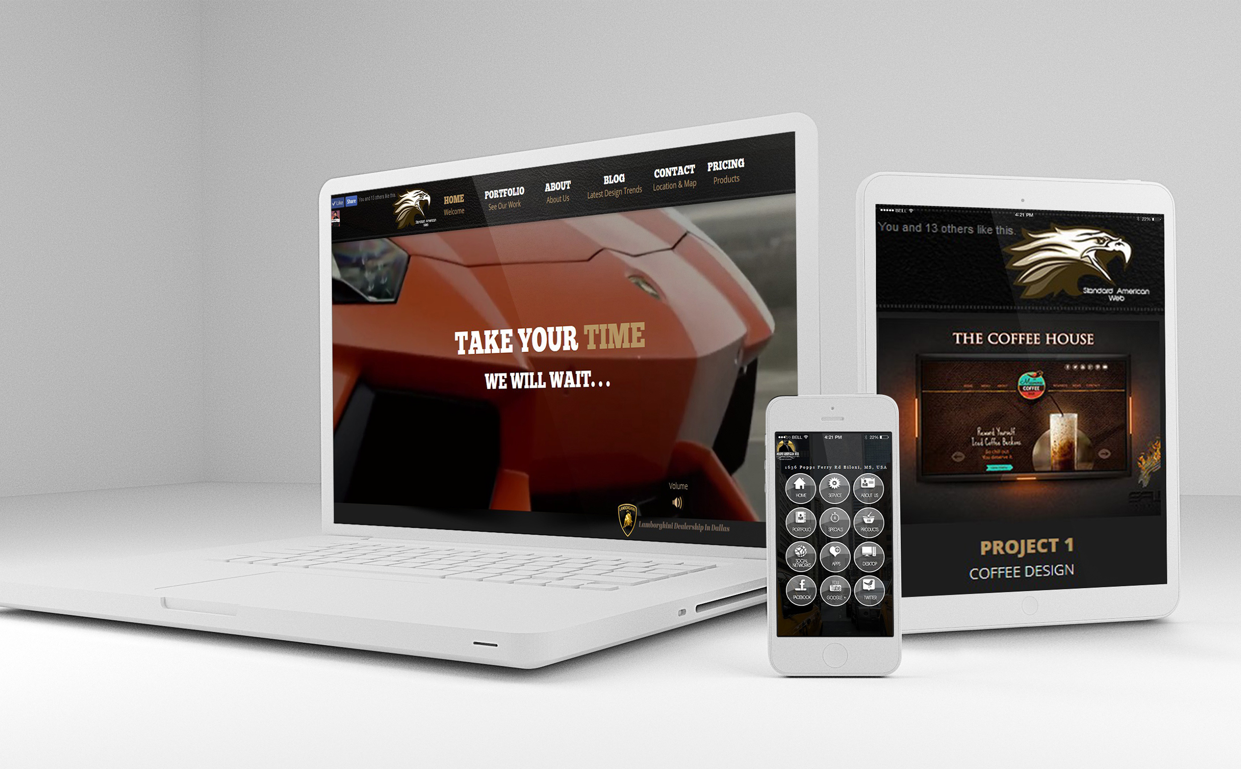
One of the key elements of responsive design is ensuring that your website looks and works great on all devices, including desktops, tablets, and smartphones. However, testing your website on just one device may not give you a complete picture of how it performs across different platforms. To ensure that your website is truly responsive and user-friendly, it's important to test it on multiple devices.
According to a study by Statista, in 2020, 50.81% of website traffic worldwide was generated through mobile devices. This means that if your website is not optimized for mobile devices, you could be missing out on a significant portion of your potential audience. To make sure your website is up to par, consider the following tips:
- Test your website on a range of different devices, including various smartphones, tablets, laptops, and desktops.
- Use tools like Google's Mobile-Friendly Test and BrowserStack to help you test your website on different devices.
- Check for any display issues, such as broken images or distorted layouts.
- Test your website's performance, including loading times and user experience, on different devices.
By testing your website on multiple devices, you can ensure that it is fully optimized for all users, no matter what device they're using.
9. Minimize loading times -

Nobody likes a slow-loading website, and visitors will quickly move on if they have to wait too long. Slow loading times can also negatively affect your website's search engine rankings. To minimize loading times, you should optimize your website's images, minimize the use of plugins, and use a reliable hosting service. It's also a good idea to compress your website's files and eliminate any unnecessary code. By doing these things, you'll ensure that your website loads quickly and efficiently, providing a better user experience for your visitors.
When it comes to optimizing images, there are several things you can do to reduce file size without sacrificing quality. One option is to use a compression tool like TinyPNG, which can significantly reduce image file sizes without affecting quality. You can also use image formats that are optimized for the web, such as JPEG or PNG. Additionally, make sure to resize images to their proper dimensions, rather than simply scaling them down within your website's code.
To minimize the use of plugins, it's important to carefully evaluate which ones are truly necessary for your website's functionality. Every plugin you add to your website will increase its load time, so it's important to keep them to a minimum. Finally, selecting a reliable hosting service is crucial to ensuring fast load times. Choose a hosting provider with a good reputation for speed and uptime, and consider using a content delivery network (CDN) to further improve loading times for visitors in different geographic locations.
10. Analyze and optimize -

Once your website is up and running, it's important to continually analyze its performance and make improvements as needed. This includes tracking user behavior, such as page views, bounce rates, and conversion rates, and using that data to make informed decisions about how to improve your website. You can use tools like Google Analytics to track this information and gain valuable insights into your website's performance.
It's also important to keep your website up to date and make changes as needed. This can include updating content, optimizing images, and testing different layouts or designs. A/B testing can be a useful tool for optimizing your website, allowing you to test different versions of a page to see which one performs better. Finally, make sure to stay up to date with the latest trends and best practices in web design and optimization, so that you can continue to provide the best possible user experience for your visitors.
The Wrap Up:

In conclusion, responsive design is essential to providing the best user experience for your customers. By planning your content with user intent in mind, adopting a mobile-first approach, implementing chatbots, optimizing images, using a grid system, keeping it simple, using clear typography, testing on multiple devices, minimizing loading times, and analyzing and optimizing, you can create a website that meets the needs of your users and enhances their experience.
Remember, the primary goal of a website is to provide value to its visitors. With responsive design, you can ensure that visitors have a positive experience, no matter what device they're using. This can lead to increased engagement, improved conversion rates, and ultimately, a better return on your investment.
So, if you're planning to create a website or improve an existing one, keep responsive design at the forefront of your strategy. Your users will thank you for it.
As you move forward with implementing responsive design, you may have some questions. For example,
How can you balance aesthetic design with functionality?
How can you effectively measure the success of your website's responsiveness? And, what are some best practices for optimizing images on your website?
These are all great questions to consider as you work to provide the best possible user experience for your customers.